Working as a PM involves working with a lot of data. So, it is easy to get sucked into the numbers and ignore the story behind the numbers.
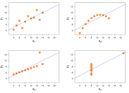
To highlight why this isn't a good practice, here is Anscombe's Quarter - four sets of numbers that look identical on paper (mean, variance, etc) but look completely different when graphed.
To highlight why this isn't a good practice, here is Anscombe's Quarter - four sets of numbers that look identical on paper (mean, variance, etc) but look completely different when graphed.
Don't ignore the story behind the numbers.


CONVERSATION